Nutritionist Website Design: 6 Tips For a Site that Slaps
Need a hard-working Squarespace website for your private nutrition practice?
You’re in the right spot! Explore the website design services »
Newly qualified and just getting started as a nutritionist or dietician? Firstly - congratulations! 🎉 I’m genuinely so excited for you to be pursuing your goals and following your heart to help others. This is SUCH an exciting time in your wellness entrepreneurship journey, and food is an important part of everyone’s wellbeing.
Now - the reason you’re here - those nutritionist website design tips.
Table of Contents
As a website designer for health and wellness professionals, and in-house copywriting coach for Amanda Jane Daley (business mentor for health and wellness coaches), I’ve spent a fair number of hours reviewing nutritionist, health coach, and wellness practitioner websites, and I’ve seen where people commonly go wrong.
So, in this post, I’m breaking down some foundational nutritionist website design tips and tricks to attract clients, grow your business, and ensure your site supports your growth goals rather than hinders them.
Why is having a high-quality, professional website important for nutritionists?
(Note, I did NOT say “perfect”!!! Perfection is a trap — trust me, coming from one overly perfectionistic copywriter and website designer. So all the things I talk about in this article are things to get “good enough” not “perfect” and to not get hung up on to the point of getting stuck.)
For starters, people do judge a book by it’s cover when it comes to your website. Stanford Web Credibility Research findings suggest that about 75% of people judge a business’s credibility based on its website design.
This means roughly three out of every four potential customers decide how trustworthy and professional a business seems from its website alone. 🫢
Why choose Squarespace for your nutritionist website design?
I recommend Squarespace (and use it myself) because:
It is easy to use & update yourself once you have your website designed for you (it’s a drag & drop design – meaning you can make tweaks & add blog posts without hiring help.) I provide my clients with training on making updates themselves as part of my Squarespace website design services.
Mobile-optimisation is built in, so your site looks beautiful on phones (where most people are searching).
Affordable, low maintenance and built-in secure hosting – no plugins to constantly update or break. You can even buy your domain directly from Squarespace.
Multi-functional - you can sell 1:1 services, digital courses, online memberships, or digital products. And it can work for a clinic or studio, as well as for a solo practitioner, coach or trainer.
Offers built-in scheduling software with Acuity. But it also plays nicely with many email marketing platforms & CRMs (such as Dubsado, Mailerlite, Flodesk, Calendly, and more)— so you can embed forms, calendars, and opt-ins from each, setting up your site as a functional sales funnel, not just a pretty brochure.
OK, now we know WHY professional website design makes you look credible (and feel confident) as a nutritionist — and WHY Squarespace is such a solid platform — let’s dive into the website design tips and best practices.
Tip 1: Be sure to include these core pages & elements (every nutritionist website should have ‘em!)
To create an effective nutritionist website, you should include several essential webpages.
Combined, these pages provide browsers with all the information they need to go from curious browser to courageous action-taker, confident buyer, and firm believer in you as the practitioner for them.
A strategic homepage. This is often the first page visitors will see, so it needs to clearly communicate who you are, what you do, who you help, and how you help them. Then it’s the doorway to other important pages on your site — and a place to scoop up people’s email addresses and contact information.
A strategic service page. You can create one overarching page or individual service pages. Potential clients want NEED to understand what you offer and how your services can solve their problems and help them reach their goals. Each service page should include a comprehensive description of what it entails, the benefits of working with you, your process (both onboarding and delivery), and any relevant pricing information. Transparency around pricing helps build trust (particularly in this economic climate), makes it easier for clients to make informed decisions, and means they are more likely to book an initial call with you.
An authority-building “About” page. This is where you can introduce yourself, share your qualifications and experience, personal story, and the root of your passion for nutrition. A genuine, well-crafted “About” page helps build a personal connection with potential clients and establishes your credibility as an expert in the field — someone who “gets” what your ideal clients are going through, and is well-equipped to help them.
Visible email opt-in(s) to build your list and improve your ability to build a client pipeline. (Studies indicate that only X amount of people are willing to purchase on the first visit to your site, so having a way to capture them before they head off into the www is great.)
Sprinkle in “Testimonials” throughout your site, or have a standalone page, to showcase client success stories. (With respect for privacy.) Positive feedback and happy outcomes from satisfied clients serve as social proof and can strongly influence potential clients' decision-making.
A booking page! Make it easy for people to take the next step by integrating your booking system into your website.
BONUS: A blog or resources section where you can share helpful content related to nutrition and wellness. Regularly updating your blog with informative articles, tips, and case studies not only positions you as an expert in your field but can also improve your website’s SEO, making it easier for potential clients to find you online. Yes please.
These core pages work together to provide a comprehensive overview of your practice and make it easy for visitors to find the information they need.
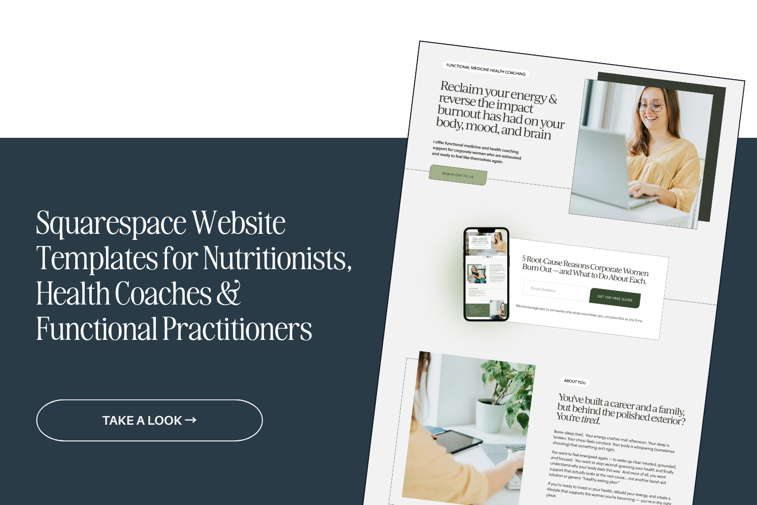
BTW — All these pages are included in my Pippa Squarespace Website Template for Nutritionists (as well as a clinical testing page) if you’re looking for a strategic site on a tighter budget.
Tip 2: Choose your colour palette and typography carefully
When used consistently across your site, your fonts and colour scheme will create a recognisable brand identity for your nutritionist business. Both colours and fonts convey a “vibe” and energy.
Nature-driven colour palettes are a popular choice amongst nutritionists.
When selecting typography, it’s important to choose fonts that are easy to read (being legible is legit ESSENTIAL).
Squarespace has some fantastic built-in fonts — across Script, Serif and Sans Serif options — and you can also install fonts you’ve purchased into your site in one click. I use a built-in font for my body copy, and a font I bought a web license for and uploaded to my site for headlines.
Some of my favourite free fonts for nutritionist website designs include:
IvyJournal
IvyMode
IvyPresto Headline
IvyPresto Display
IvyText
Operetto
Cabrito Didone
Lust Text
Mencken Std Head
Freight Display (all versions)
Minerva Modern
Freight Neo Pro
TenorSans
Quiche Pro
Sofia Pro
Raleway
Poppins
Aileron
Aktiv Grotesk
Helvetica Neue
Proxima Nova
Inter Tight
Your fonts and colour palettes work together - and it’s important to have sufficient contrast within your colour palette to make your text readable and to highlight important elements.
You could use a bold colour for call-to-action buttons to make them stand out. This can help catch website visitors’ attention to key areas and encourage them to take action, such as booking a consultation or signing up for a newsletter.
I use this website to test whether text is readable on different colour backgrounds across your site. Best practice is to aim for 5+ across most of your colour combinations of text on different backgrounds. It doesn’t need to be perfect across the board, but it's worth keeping in mind.
Tip 3: Have a clear, uncluttered top navigation
This makes it easy for your website visitors to find the information they need. No more 15 links in your top navigation with 7 drop-downs, please.
Consider: What do people need to see in order to take the next step and work with me? Those are the pages you want to link to up top. Don’t go overboard here.
You have a bottom navigation where you can store other links — the top is for the main pages on your website that help you sell your services. Think: Spark Joy philosophy … declutter your top navigation. ;-)
Try to keep to your core 4-5 links.
One way to keep things tidy is to include a (simple) dropdown menu in your top navigation bar — I’ve done this on my own site for my Services and Templates. Or, you could have one link that takes people to a landing page, and they click through to other pages from there.
Remember, the goal is to make it as easy as possible for potential clients to find the info they need and take the desired action—whether that’s booking a consult, getting to know you better, listening to a podcast episode of yours, or joining your email list.
Tip 4: Bake strategic SEO keywords into your website copy
A small paragraph for a big topic!
Search engine optimisation (SEO) is a powerful tool for ensuring your nutritionist website ranks well in search results and attracts organic traffic.
Start by brainstorming and conducting keyword research to identify the phrases your target audience searches for. I like using Uber Suggest for this, as well as Google. (And the “also asked” section of Google.)
Really think through — what might people be searching for? Use these keywords strategically throughout your website, including in your page titles, headings, meta descriptions, and content. (Without keyword stuffing - if it doesn’t read naturally when you read it back outloud, change it.)
As well as using keywords, it’s a good idea to optimise your website's loading speed by compressing all images to 250KB to 500KB before uploading them, using a tool like Tinify.
Optimising your website for SEO won’t immediately solve all your marketing problems as it takes time to kick in, BUT it can 100% increase your visibility and help you reach potential clients who are searching for nutrition-related services and information online.
Not sure what keywords to target?
Tip 5: Use cohesive, quality imagery (including brand photography)
Getting great brand photos and supporting imagery can make or break how your website looks to visitors.
Stock photos can be a good option to SUPPORT your brand photos, but using original brand photography will add a far more personal touch — and likely be far more cohesive in terms of tone, colours, and aesthetic— especially if you are a personal brand and private practice, rather than a large clinic or practice.
Stock photo libraries I’ve used include:
Elevae Visuals (paid - pricey $$)
Haute Stock (paid - pricey $$)
Unsplash (free & low-cost options)
Consider using headshots and behind-the-scenes images of you in your coaching/nutrition business to create a genuine connection with your website visitors (and prospective clients) — even if it feels uncomfortable. It does help people feel more connected to you and confident moving forward in working with you.
If you’re in Auckland, New Zealand, Zanda Photography took my brand photos, and she was wonderful! (Although she specialises in family and wedding photography now.)
Tip 6: Optimise your nutritionist website design for mobile
Cause chances are, your prospective nutrition coaching clients will be scrolling their phones looking for your support, perhaps clicking over from Instagram or TikTok — not just sitting on their desktop at the office. Right? Right. So the last thing we want is a bad experience when many of your potential clients check out your site on their phones.
Mobile optimisation means creating a responsive website design that adjusts seamlessly to different screen sizes and provides a smooth browsing experience for users on the go. My Pippa website template has already been optimised for mobile.
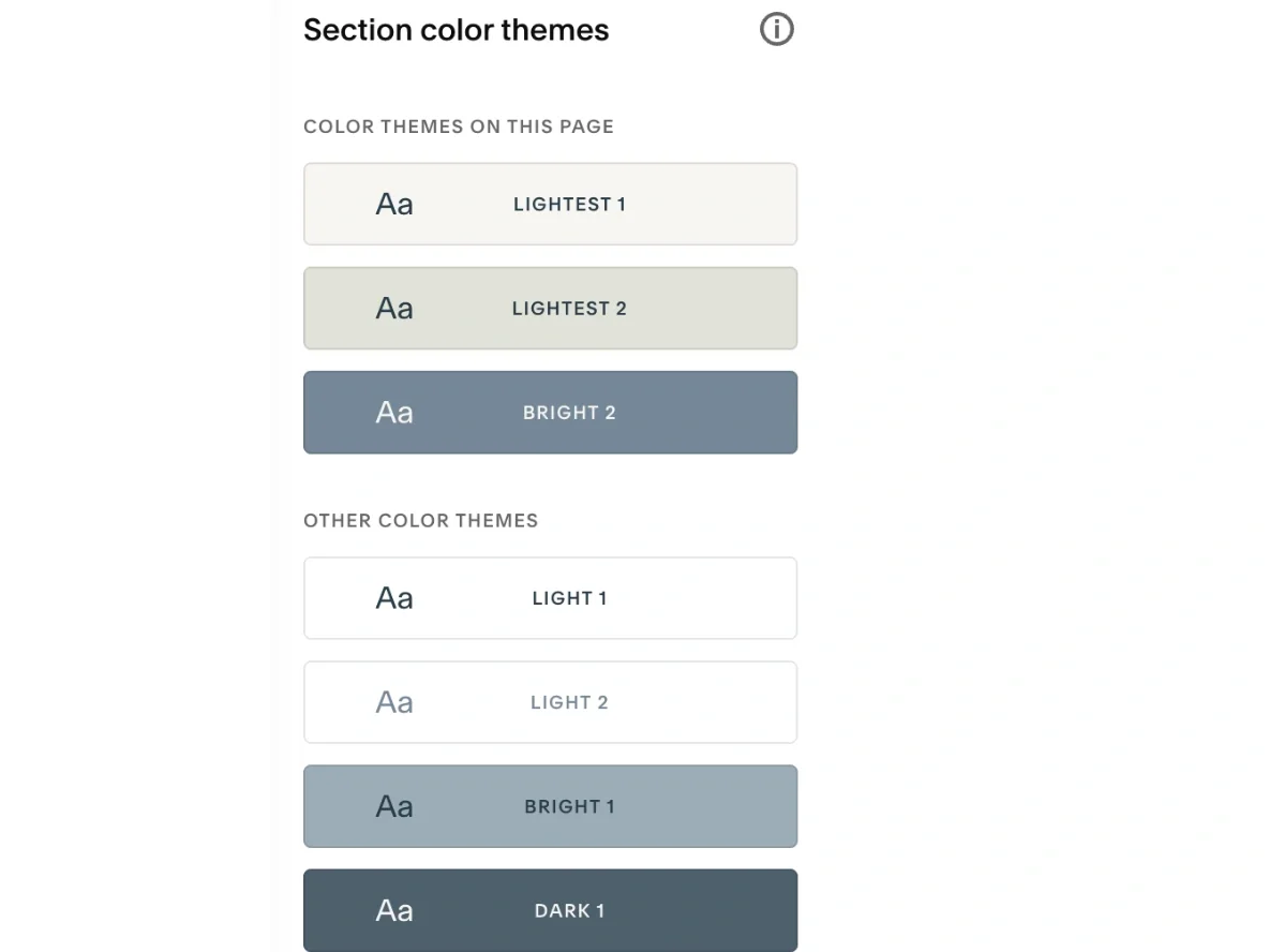
If you’re designing your own nutritionist or dietician website in Squarespace, pay attention to the layout, font sizes, and button placements on mobile to ensure that they are user-friendly on smaller screens. A new feature Squarespace has introduced lets you hide certain design elements on mobile, which can be really helpful for keeping designs tight and tidy. (See image below)
Pro tip: Squarespace does love to shuffle mobile designs around after you’ve made changes on the desktop version, so check your website on different devices (phones, tablets, laptops, desktop) to make sure that it looks good and provides a consistent and enjoyable user experience for all visitors, ESPECIALLY if you’ve been updating it.
You’re welcome! 🤭
That’s a wrap! Time to bring it all together for a site you’re stoked to share.
OK - now we’re all clear that potential clients are way more likely to work with someone who presents their services online in a polished and professional manner.
And you understand why, when you promote a sub-par site, you risk losing out on 75% of your target market who search online for nutrition advice, consultations, and services — because you’re pushing them away as soon as they land on your digital doorstep.
A well-designed website houses strong copy, clearly communicates your services, shows people why you are the nutritionist for them, and tells them what to do next.
When building yours, focus on the key elements outlined in this article to create a solid online presence that supports your practice's success and growth. :)
And if you want help, check out my Squarespace website design services and website copywriting or copyediting services.
Get a credibility & confidence-boosting nutritionist website
Ready to create a custom nutritionist Squarespace website that reflects your vision, passion & expertise?
Fill out the form here and let’s get started.